

Charts
The Charts component in PROCESIO Forms allows you to visualize data returned by processes directly inside your forms. Instead of displaying raw…
Charts in PROCESIO Forms
Overview
The Charts component in PROCESIO Forms allows you to visualize data returned by processes directly inside your forms. Instead of displaying raw numbers or tables, you can render dynamic, interactive charts that update automatically based on your process output.
Charts are ideal for building internal dashboards, monitoring workflows, tracking trends, and presenting data summaries to end-users — all without leaving the form context.
Supported Chart Types
PROCESIO currently supports four chart types, each suited for different data visualization needs:
| Chart Type | Best Used For |
|---|---|
| Bar | Comparing values across categories |
| Line | Showing trends over time |
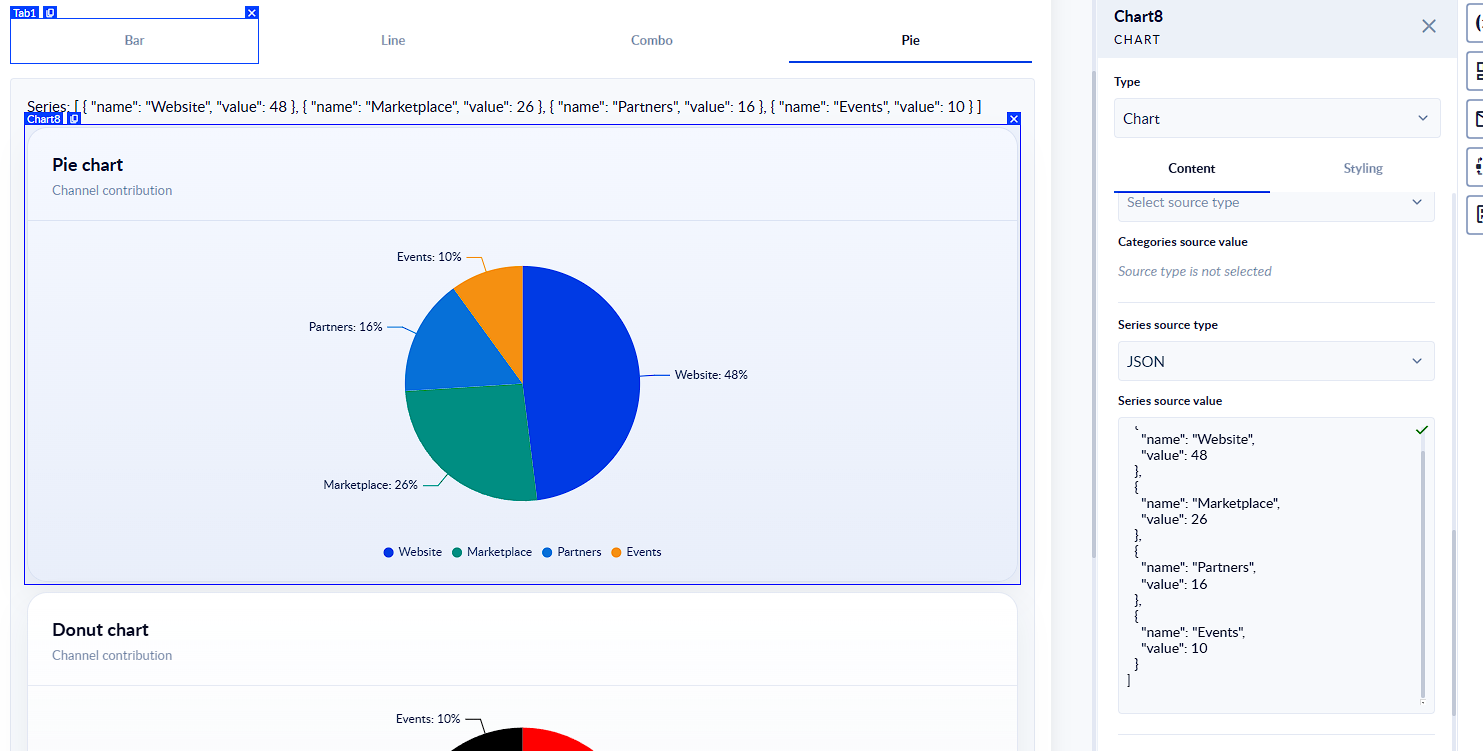
| Pie | Displaying proportions or distributions |
| Combo | Combining bar and line data in one view |
Adding a Chart to a Form
To add a chart component to your form:
- Open the Form Designer in PROCESIO.
- In the component panel, locate the Chart component.
- Drag and drop it onto your form canvas.
- Open the component's Settings panel to configure
Chart Configuration
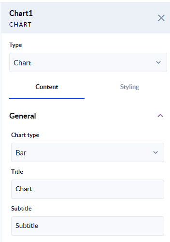
Title & Subtitle
- Title — The main heading displayed above the chart.
- Subtitle — An optional secondary line of text shown below the title, useful for adding context or units.
Height
Sets the vertical size of the chart on the form canvas. Enter a value in pixels (e.g., 400).
Axis Names
Configure the axis labels to make your chart easier to read:
- X Axis Name — Label for the horizontal axis (e.g., Month, Department).
- Y Axis Name — Label for the primary vertical axis (e.g., Count, Revenue).
- Secondary Y Axis Name — Label for a second vertical axis, used in Combo charts when two data series have different scales.
Empty Text
The message shown inside the chart area when no data is available or the process returns an empty result. Use this to provide a helpful hint, such as "No data available for the selected period".
Display Controls
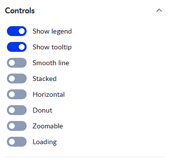
These toggles control the visual behavior and interaction of your chart.
| Control | Description |
|---|---|
| Show Legend | Displays a color-coded legend identifying each data series. |
| Show Tooltip | Enables hover tooltips that reveal exact values when a user mouses over a data point. |
| Smooth Line | Renders Line and Combo chart lines as curves instead of straight segments. |
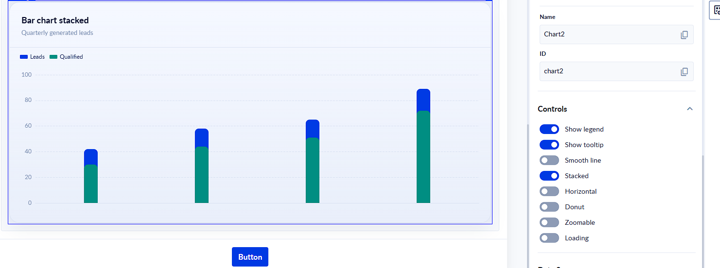
| Stacked | Stacks multiple data series on top of each other (Bar charts). Useful for part-to-whole comparisons. |
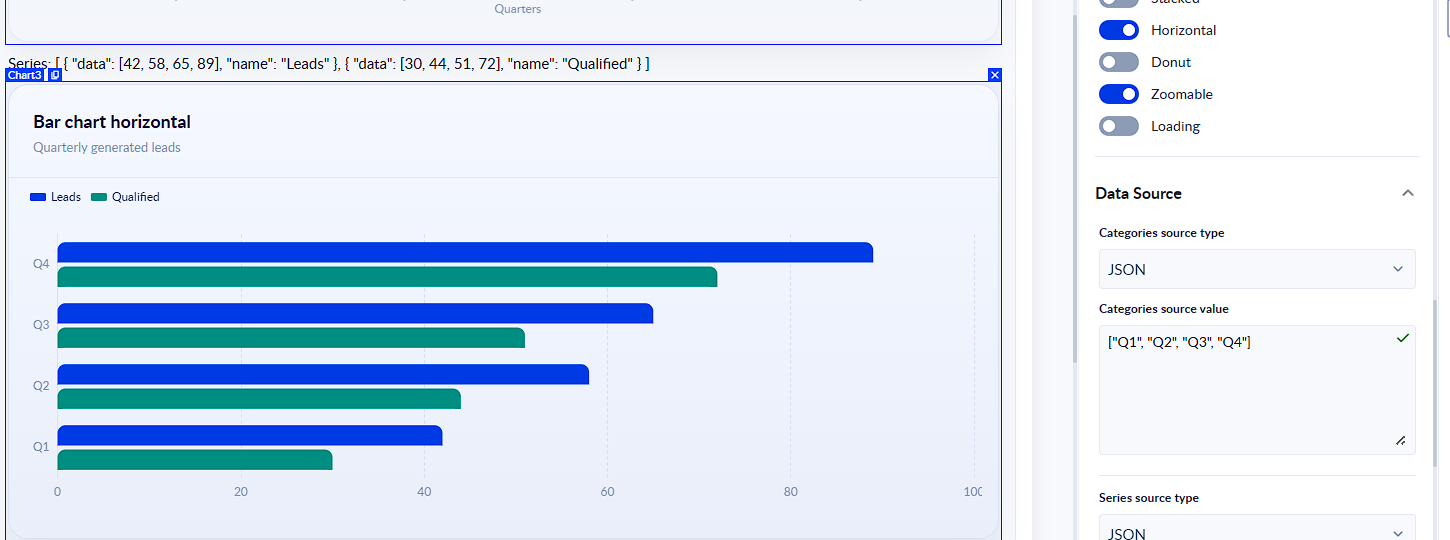
| Horizontal | Flips the Bar chart to render horizontally instead of vertically. |
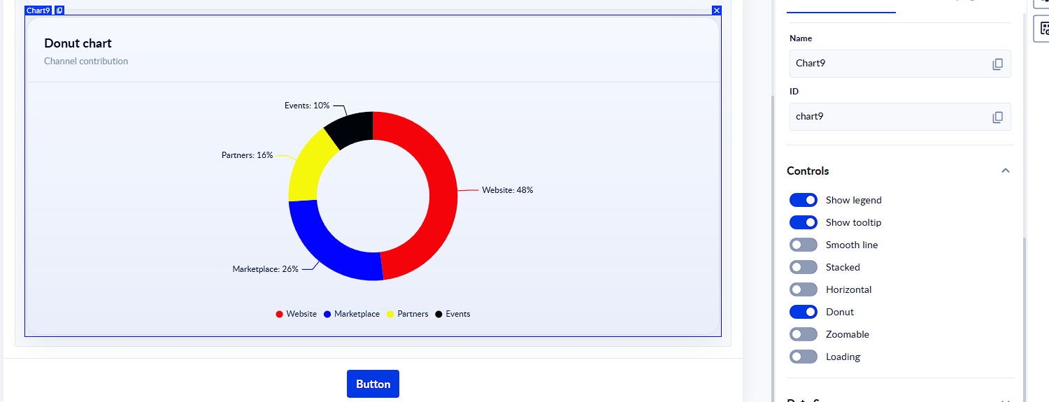
| Donut | Converts a Pie chart into a Donut chart (hollow center). |
| Zoomable | Enables zoom and pan interaction on the chart, useful for large datasets. |
| Loading | Displays a loading indicator on the chart while data is being fetched from the process. |
Data Source Configuration
Charts receive their data from a process output. You configure the data source using two settings:
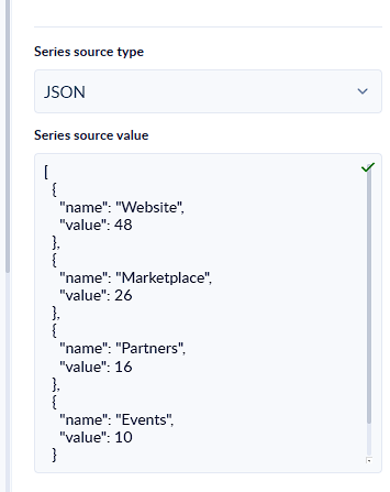
Series Source Type
Defines how the chart receives its data. Two options are available:
- JSON — Data is provided as a static JSON value or bound directly from a process variable.
- URL — Data is fetched from an external URL that returns a JSON response.
Series Source Value
The actual data binding or URL. For JSON mode, this is typically mapped to a process output variable that returns a JSON array.
⚠️ Important: Each chart type expects a different JSON structure. Using the wrong format will result in an empty or incorrect chart. Refer to the formats below when preparing your process output.
Bar Chart JSON
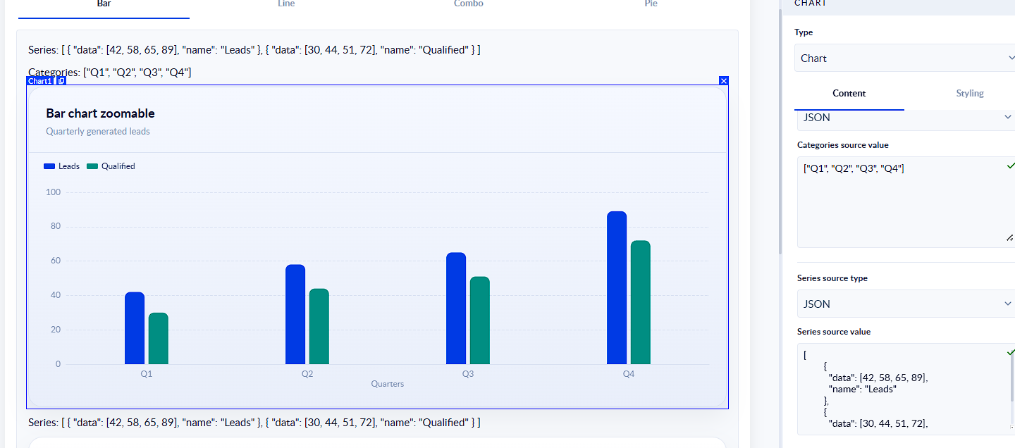
Each object in the array represents one series (a group of bars). The data array contains the values for each category, and name is the series label shown in the legend.
json
[ { "data": [42, 58, 65, 89], "name": "Leads" }, { "data": [30, 44, 51, 72], "name": "Qualified" }]
The category labels for the X axis (e.g., Q1, Q2, Q3, Q4) are configured separately via the axis mapping settings, not inside the JSON.
Line Chart JSON
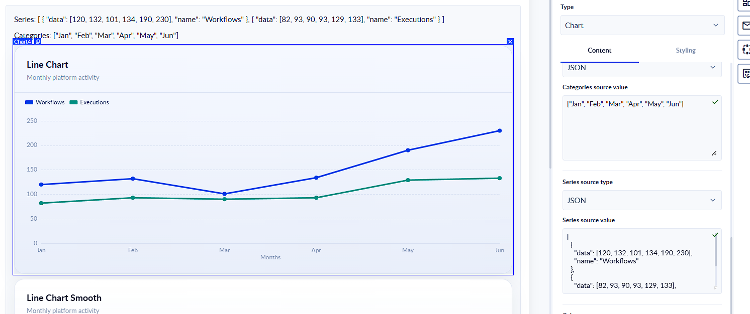
Same structure as Bar. Each object is a series with a data array of numeric values and a name for the legend.
json
[ { "data": [120, 132, 101, 134, 190, 230], "name": "Workflows" }, { "data": [82, 93, 90, 93, 129, 133], "name": "Executions" }]
Pie / Donut Chart JSON
Pie charts use a flat array of named values. Each object must have a name (the segment label) and a value (the numeric size of the segment). This is different from Bar and Line — there is no data array.
json
[ { "name": "Website", "value": 48 }, { "name": "Marketplace", "value": 26 }, { "name": "Partners", "value": 16 }, { "name": "Events", "value": 10 }]
The value fields do not need to sum to 100 — PROCESIO calculates the percentages automatically.
Combo Chart JSON
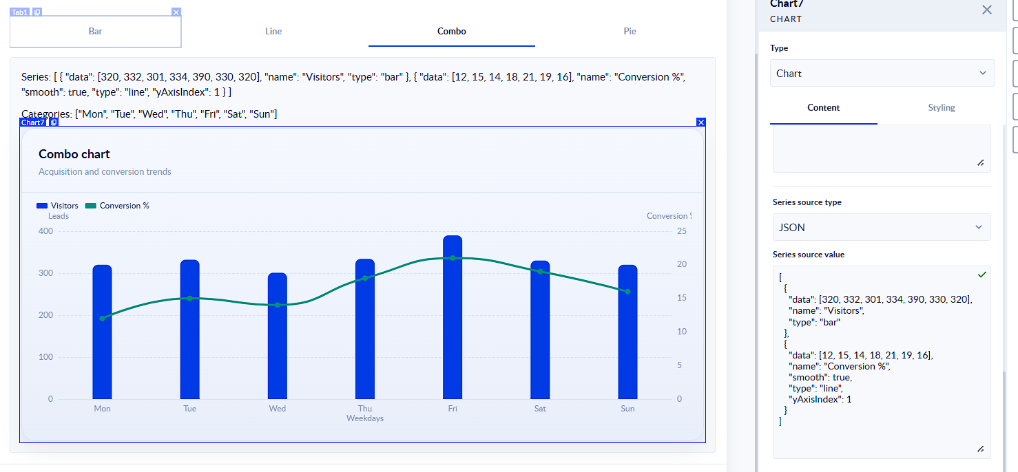
Combo charts mix series types in a single array. Each object must include a type field set to either "bar" or "line". Line series can also include "smooth": true and "yAxisIndex": 1 to plot against the secondary Y axis when the two series have different scales.
json
[ { "data": [320, 332, 301, 334, 390, 330, 320], "name": "Visitors", "type": "bar" }, { "data": [12, 15, 14, 18, 21, 19, 16], "name": "Conversion %", "smooth": true, "type": "line", "yAxisIndex": 1 }]
Use "yAxisIndex": 1 on a series when it should be plotted against the Secondary Y Axis. Remember to also set the Secondary Y Axis Name in the chart settings so the axis is labeled correctly.
Colors & Visual Customization
Colors
The Colors field is optional. If you leave this field empty, the chart will automatically use the default colors.
You can also customize the colors by adding an array of color values. The colors will be applied in order to the chart items.
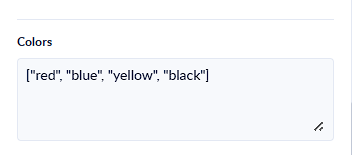
The values can be:
["red", "blue"]; ["CD5C5C"]; [{"rgba": [255, 0, 0, 1]} ]
Option Overrides
For advanced users, Option Overrides allows you to pass a raw configuration object to the underlying chart engine. This enables fine-grained control over visual properties not exposed in the standard UI, such as custom fonts, grid lines, or animation settings.
Chart Types in Detail
Bar Chart
Bar charts compare values across discrete categories. Use the Horizontal toggle to switch between vertical bars (column chart) and horizontal bars.
Common use cases:
- Submissions per status
- Requests per department
- Count of records per category
Enable Stacked to layer multiple series, making it easy to see both totals and sub-group composition at a glance.
Line Chart
Line charts display continuous data over time, making it easy to spot trends and patterns.
Common use cases:
- Submissions over time
- Activity tracking per day/week/month
- Process execution volume trends
Enable Smooth Line for a curved, modern look. Enable Zoomable when working with dense time-series data.
Pie Chart
Pie charts show the proportional breakdown of a whole into its parts.
Common use cases:
- Distribution of request types
- Status breakdown (e.g., Open / In Progress / Closed)
- Percentage of records per category
Enable Donut to render the same data as a Donut chart — a popular modern alternative that leaves space in the center for a summary label.
Combo Chart
Combo charts combine Bar and Line series in a single visualization. This is useful when you want to show both volume (bars) and a trend or rate (line) together.
Use the Secondary Y Axis Name when the two series have different scales — for example, displaying both raw counts (bars) and a percentage rate (line) on the same chart without distortion.
Interactive Features
When configured, charts support the following interactions for end-users:
- Hover Tooltips — Mouse over any data point or bar to see the exact value. Enable via the Show Tooltip toggle.
- Zoom & Pan — Available on Line and Combo charts when Zoomable is enabled. Users can click and drag to zoom into a time range and scroll to pan.
- Legend Toggle — When Show Legend is on, users can click legend items to show or hide individual series.
Best Practices
- Match chart type to your data story. Use Bar for comparisons, Line for trends, Pie/Donut for proportions, and Combo when you need two different metrics on the same canvas.
- Keep series count manageable. Charts with more than 5–6 series can become hard to read. Consider filtering or aggregating data at the process level before passing it to the chart.
- Always set meaningful axis names. Users shouldn't need to guess what the axes represent.
- Use Empty Text. Always fill in the Empty Text field so users understand why no chart is showing, rather than seeing a blank space.
- Use Subtitle for units or context. For example, "Values in USD" or "Data refreshed daily".
- Enable Loading when your process may take a moment to return data, so users know the chart is working.
Limitations (Current Version)
The following features are not available in the current release:
- Export to PNG or PDF
- External embedding of charts
- Advanced analytics (forecasting, AI-driven insights)
- Scatter plot, Bubble, Radar, Heatmap, and Funnel chart types