Themes
The Themes feature in Formbuilder by PROCESIO allows you to customize the appearance of your forms, ensuring a cohesive and visually appealing user…
The Themes feature in Formbuilder by PROCESIO allows you to customize the appearance of your forms, ensuring a cohesive and visually appealing user experience. With a comprehensive set of properties ranging from colors to fonts and form elements, you can tailor the look and feel of your forms to match your brand identity or design preferences.
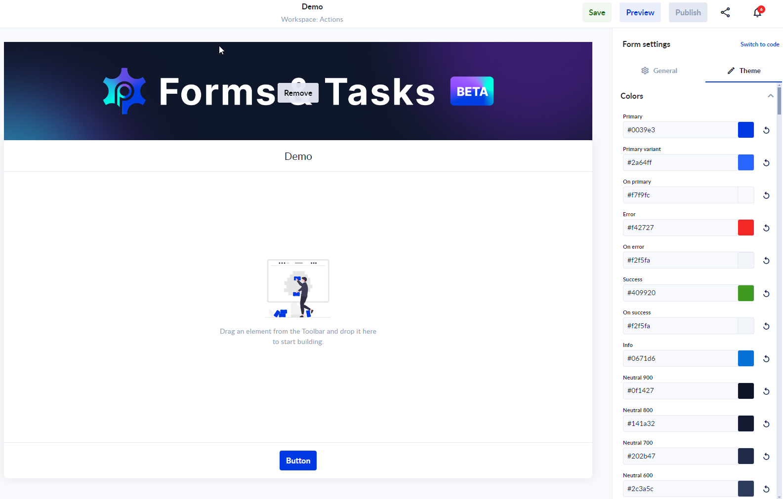
Colors:
This comprehensive set of theme properties empowers you to craft visually stunning forms that align perfectly with your brand's aesthetic. Experiment with different combinations to create the perfect look for your forms. You can add your own color codes to further customize your forms and you can always use the refresh button next to each color to restore the default value.
- Primary:
- #0039e3
- Primary Variant:
- #2a64ff
- On Primary:
- #f7f9fc
- Error:
- #f42727
- On Error:
- #f2f5fa
- Success:
- #409920
- On Success:
- #f2f5fa
- Info:
- #0671d6
- Neutral 900:
- #0f1427
- Neutral 800:
- #141a32
- Neutral 700:
- #202b47
- Neutral 600:
- #2c3a5c
- Neutral 500:
- #8d9bb5
- Neutral 400:
- #c3cee2
- Neutral 300:
- #e3e8f3
- Neutral 200:
- #ecf1f8
- Neutral 100:
- #f2f5fa
- Neutral 50:
- #f7f9fc
Fonts:
- Input Font Size:
- 14px
- Input Line Height:
- 20px
- Label Font Size:
- 12px
- Label Line Height:
- 16px
- Button Font Size:
- 16px
- Heading Font Size:
- 21px
- Heading Line Height:
- 25px
- Paragraph Font Size:
- 15px
- Paragraph Line Height:
- 22px
Form:
- Background Color:
- Neutral 50
- Surface Color:
- White
- Padding:
- 16px
- Gap:
- 20px
- Link Color:
- Primary
- Link Decoration:
- None
- Heading Color:
- Neutral 800
- Paragraph Color:
- Neutral 800
Input:
- Width:
- Inherit
- Height:
- 40px
- Padding Vertical:
- 10px
- Padding Horizontal:
- 8px
- Label Color:
- Neutral 800
- Input Color:
- Neutral 800
- Placeholder Color:
- Neutral 500
- Background Color:
- Neutral 50
- Background Color Hover:
- Neutral 100
- Alternative Background Color:
- White
- Alternative Background Color Hover:
- Neutral 50
- Border Radius:
- 4px
- Border Width:
- 1px
- Border Color:
- Neutral 300
- Border Color Focused:
- Primary
- Border Color Error:
- Error
- Outline Width:
- 4px
Select:
- (Properties similar to Input)
Button:
- (Properties similar to Input)
Checkbox:
- (Properties similar to Input)
Radiobox:
- (Properties similar to Input)
Approval:
- (Properties similar to Input)
File Upload:
- (Properties similar to Input)
Section:
- (Properties similar to Input)
List:
- (Properties similar to Input)
Columns:
- (Properties similar to Input)
Stepper:
- (Properties similar to Input)
Tabs:
- (Properties similar to Input)