

Carousel
The Carousel element shows a set of slides one at a time, with arrows, slide indicators, swipe and optional autoplay to move between them.
The Carousel element is a container that shows its content as slides, one slide at a time. Each slide holds its own form elements: text, images, fields, buttons. The person filling the form moves between slides with arrows, slide indicators, the keyboard or a swipe, or the carousel moves on its own.
All the slides belong to the same form. Values entered on any slide are submitted with the form, whichever slide is showing when the person clicks submit.
Key use cases
- An introduction or onboarding tour shown at the top of a form
- A gallery of images or product cards, one at a time
- A long form split into short parts without the strict order of a Stepper
- Announcements or tips that rotate on their own with autoplay
Add the element to a form
- Open the form in the Form Designer.
- In the Toolbar, open the Structure tab (or type
Carouselin Search element). - Drag Carousel onto the form.
- Select the carousel to open its settings.
A new carousel has three slides. Its arrows and slide indicators work in the designer too, so you can move to any slide and fill it.
Add elements into the slides
Move the carousel to the slide you want to fill, then drag elements from the Toolbar onto it. An empty slide shows Drag and drop slide elements here. A slide can hold any number of elements, including containers such as a Section or Columns.
The Slides setting lists the carousel's slides in order:
- Add slide adds a new empty slide at the end.
- The text box of a slide renames it. The name is used to refer to the slide in events and scripts.
- The gear icon opens the slide's own settings: Visible, Name and ID, and on the Styling tab the layout of the elements inside the slide.
- The trash icon deletes the slide.
When you select an element on the canvas that sits on another slide, the carousel moves to that slide.
A carousel cannot be placed inside another carousel. The designer does not let you drop a carousel, or a container that holds a carousel, onto a slide.
Which slides the person filling the form sees
On the form, a slide is shown only when it is visible and holds at least one visible element. Hidden slides and empty slides are skipped by the arrows, the indicators and autoplay, and are not counted (a carousel with one hidden slide out of three shows 2 indicators). If you hide a slide before the one the person is on, they stay on the same slide.
When there is only one slide to show, the carousel shows it without arrows or indicators.
Settings
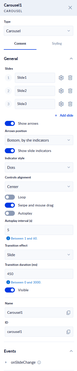
| Setting | What it does |
|---|---|
| Slides | The carousel's slides, in order. See Add elements into the slides. |
| Show arrows | On (default): previous and next arrows are shown. |
| Arrows position | Where the arrows sit: Bottom, by the indicators (default), Sides of the slide, or Over the slide. At the bottom the arrows are plain icons; on the sides and over the slide they are round buttons. |
| Show slide indicators | On (default): one indicator per slide is shown under the slides. Clicking an indicator moves to that slide. |
| Indicator style | Dots (default), Lines, or Counter (2 / 4), which shows the current slide number and the number of slides as text instead of clickable indicators. |
| Controls alignment | Where the row of indicators and controls sits: Left, Center (default) or Right. |
| Loop | Off (default): the previous arrow stops at the first slide and the next arrow stops at the last. On: the next arrow goes from the last slide back to the first, and the previous arrow from the first to the last. |
| Swipe and mouse drag | On (default): the person can move between slides by swiping on a touch screen or dragging with the mouse. See Swipe and drag. |
| Autoplay | Off (default). On: the carousel moves to the next slide on its own. See Autoplay. |
| Autoplay interval (s) | How many seconds each slide is shown when Autoplay is on. Between 1 and 60, default 5. |
| Transition effect | The animation between two slides: Slide (default), Fade, Zoom, Cover, Flip or None. Slide, Cover and Flip follow the direction of the move: forward animates one way, back the other. |
| Transition duration (ms) | How long the animation lasts, in milliseconds. Between 0 and 3000, default 450. 0 changes the slide at once. |
| Visible | Show or hide the whole carousel. |
| Name, ID | The element's name and ID, used to refer to the carousel in events and scripts. |
The two number fields keep their values within their limits. Under each, the field shows its range (Between 1 and 60., Between 0 and 3000.). A value outside the range is changed to the nearest limit when you leave the field, and that is the value saved with the form. Leave a field empty to use its default.
If both Show arrows and Show slide indicators are off, the carousel still keeps a way to the other slides: the arrows appear when the person reaches the carousel with the Tab key.
What the person filling the form sees

After clicking the next arrow, the second slide is shown and the second dot is filled:

Keyboard
- The arrows and the indicators are buttons, so the person can reach them with Tab and use them with Enter or Space.
- While an arrow or an indicator has focus, the Left and Right arrow keys move to the previous or next slide.
- Screen readers announce the carousel, the position of each slide (for example 2 of 3) and every move.
Swipe and drag
With Swipe and mouse drag on and more than one slide, the person can drag a slide sideways with a finger or the mouse. A short drag springs back; a longer one moves to the next or previous slide. Dragging up or down scrolls the page as usual, and a drag that starts on a field, a button or a link is left to that element, so typing and clicking inside a slide work as normal.
Swipe works on the form only, not while you edit the carousel in the designer.
Autoplay
With Autoplay on, the carousel moves to the next slide every Autoplay interval (s) seconds.
- It pauses while the pointer is over the carousel and goes on when the pointer leaves.
- It stops once the person moves into the carousel with the keyboard or clicks a control in it.
- A pause button is shown with the indicators. The person can stop the slideshow with it and start it again with the same button.
- For people whose device asks for reduced motion, the carousel does not play on its own and no pause button is shown. They move between slides with the arrows and indicators.
Autoplay does not run while you edit the form in the designer.
Required fields on other slides
A required field can sit on a slide that is not showing. When the person submits the form with such a field empty, the form is not submitted, and the indicator of that slide shows a warning icon (screen readers read it as has a field to fix). Clicking the indicator moves to the slide, where the field is marked. The warning goes away as soon as the field is filled.
With Indicator style set to Counter (2 / 4) there are no indicators to carry the warning, so consider Dots or Lines for a carousel with required fields.
A carousel in a List
A carousel can be placed inside a List. Each row of the list has its own carousel, and moving one row's carousel does not move the others.
Events
The carousel has one event, under Events in its settings:
| Event | When it fires |
|---|---|
| onSlideChange | Each time the carousel moves to another slide. The $event variable holds the index of the slide now shown, starting from 0. |
For example, use onSlideChange to show a field or update a value when the person reaches the last slide.
Move between slides from JavaScript
Two functions move a carousel one slide forward or back, the same as clicking its arrows. Call them from any Trigger JAVASCRIPT event in the form, for example the onClick event of a button:
| Function | What it does |
|---|---|
| goToNextSlide() | Moves to the next slide. On the last slide it does nothing, unless Loop is on: then it goes back to the first slide. |
| goToPreviousSlide() | Moves to the previous slide. On the first slide it does nothing, unless Loop is on: then it goes to the last slide. |
ProcesioForm.data.fields.Carousel1.goToNextSlide();
ProcesioForm.data.fields.Carousel1.goToPreviousSlide();
Here Carousel1 is the name of your Carousel element. Moving the carousel this way also fires its onSlideChange event.
- A carousel inside a List does not offer these functions.
- The designer's Preview doesn't run form scripts. Test on the published form.
Styling
On the Styling tab of the carousel's settings you can change how it looks. Turn on the check box next to a property to override the form theme for this carousel.
| Property | Default | What it changes |
|---|---|---|
| Gap | 16px | The space between the slides and the controls. |
| Padding vertical, Padding horizontal | 16px | The space between the edge of a slide and its content. |
| Surface background color | Neutral 50 | The background of the slides. |
| Surface border radius, Surface border width, Surface border color | 4px, 1px, Border | The border around the slides. |
| Slide min height | 0px | The minimum height of a slide. Set it to keep the carousel the same height on short and tall slides. |
| Arrow color | Neutral 700 | The colour of the plain arrows (at the bottom), the pause button and the counter. |
| Round arrow background color, Round arrow icon color | Neutral 700, Neutral 0 | The colours of the round arrows (on the sides or over the slide). |
| Arrow border radius | 50% | The shape of the round arrows. |
| Indicator color, Indicator fill, Indicator color active | Neutral 800, Neutral 100, Neutral 800 | The colours of the dots and lines, and of the current one. |
CSS Classes applies classes from the form's own CSS code (Form settings → Switch to code).
Each slide has its own Styling tab too (open it with the gear icon in Slides): Gap (default 10px) between the elements in the slide, and Inner direction, Inner main axis and Inner cross axis to lay them out in a column or a row.
You can also style every carousel of the form at once in the form's Theme.
For support, please join our Discord community for further assistance and support.
Tabs
The Tabs element organizes form content into multiple tabbed panels, allowing users to switch between different views or sections of a form without…
Side Panel
The Side Panel element creates a collapsible overlay drawer that slides in from the side of the form when triggered. It is a space-efficient pattern…